Photograph: Where Stillness Resides
Minneapolis Institute of Art, 2025
This shot happened almost by accident, we had thought we may get a cool photo if we each stood in opposing windows of each other — it was just one of those moments where the light, the space, and the subject all fall into place without trying too hard. I wasn’t planning on setting up a well-thought out composition; I just noticed how the sun was spilling perfectly into the gallery through the sky lights, giving the space a kind of hush.
I framed it from below to exaggerate the height and structure of the balcony — letting the lines lead your eye right to her. Centered composition felt natural here, especially with all the symmetry in the architecture. I kept my aperture fairly open to soften the background just slightly, but not so much that it lost the detail of the figure in the painting behind her. That dialogue — between her and the art — was important to keep.
What makes this one work, to me, is contrast: the pop of red against the neutral stone, the living moment inside a space built to preserve the past. It feels like a quiet interruption — just long enough to catch your breath and move on.
Sometimes the best shots are the ones you don’t overthink. This was one of those.
Settings: 46.5mm • ISO 5000 • f4.0 • 1/160
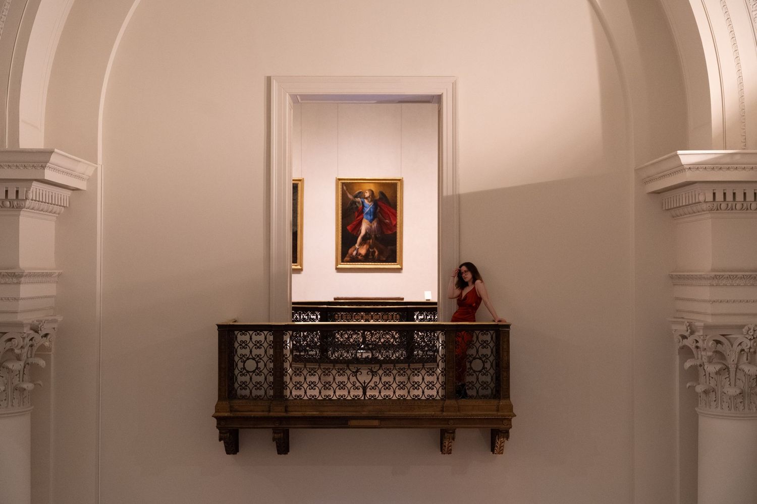
46.5mm • ISO 5000 • f4.0 • 1/160
The Edit:
This image was one of those photographs that, as soon as I saw it in my camera, I knew it had potential — but it needed the right edit to truly come alive. I shot this inside a museum with beautiful architecture, but the original lighting felt a bit too neutral and flat. I wanted to bring out the warmth and depth to match the feeling I had when I was standing there in person. Let me walk you through my editing process!
Step 1: Setting the Mood with Warm Tones
The first thing I wanted to do was add warmth to the entire scene. In photography, white balance controls the temperature of your photo. By pushing the tones towards the warm (orange/yellow) side, I gave the image a golden glow, almost like it was lit by sunset. This helps the scene feel more inviting and timeless, and it complements the red dress and the painting beautifully.
Step 2: Directing the Eye with Light and Dark
Next, I worked on controlling where the viewer’s eye goes. In photography, this is often called leading the eye or visual flow. I darkened the outer edges of the image (a technique known as vignetting) to naturally pull attention toward the center, where the subject and the painting are.
This is something I love doing because it subtly guides people through the image without them even realizing it!
Step 3: Keeping the Focus Bright
While darkening the edges, I made sure to keep the center of the photo bright — especially around the painting and the person in the red dress. This balance between light and shadow is crucial. Too dark, and you lose details; too bright, and you lose depth. I wanted the painting to almost glow, and I think this really helped elevate the final image.
Step 4: Enhancing Details, Gently
Lastly, I did some gentle adjustments to the texture and contrast. I brightened the highlights a bit (that’s the brightest parts of the image) and softened the shadows so they didn’t become too harsh. This helped bring out the beautiful architectural details without making the image feel too heavy.
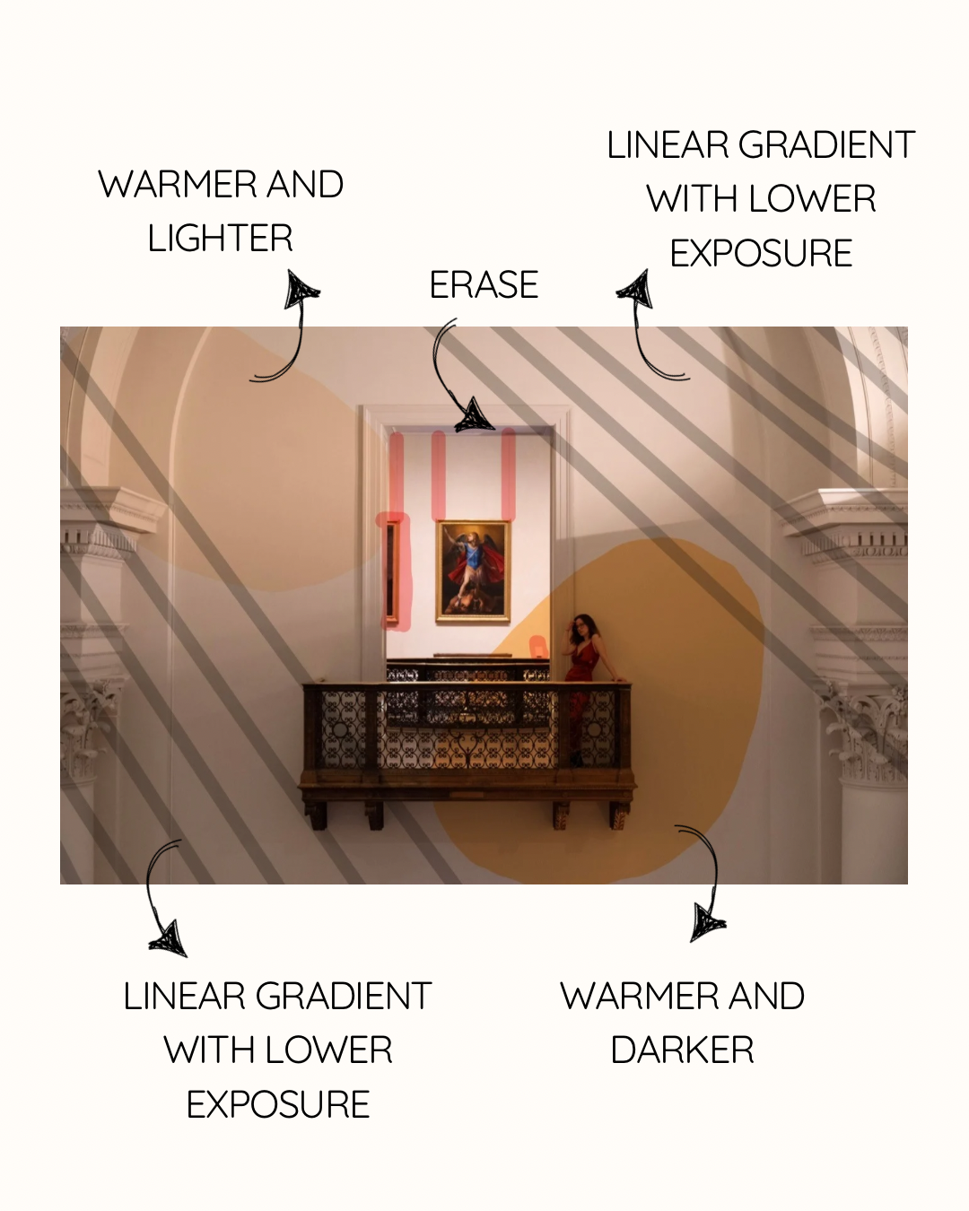
Editing Breakdown:
(Edited in Lightroom Classic)
1. Basic Panel
This is where I gave the image its warmth and glow:
- Temp: +20 — to push that golden warmth and blend the shadows into the stone.
- Exposure: +0.35 — just a slight lift overall.
- Contrast: +15 — to keep the drama in the shadows and give the architectural details some punch.
- Highlights: -20 — to pull back any glare from the lighting, especially on the walls.
- Shadows: +35 — this was key to unlocking the carved details without flattening the mood.
- Whites: +10
- Blacks: -10 — a small adjustment to preserve depth.
2. Presence
- Texture: +5 — to keep that subtle bite in the architecture.
- Clarity: +8 — just enough to give the ironwork a little edge.
- Dehaze: 0 — didn’t touch this; I wanted to keep it light and airy.
3. Tone Curve
I did a slight S-curve to enhance contrast without crushing the blacks:
- Pulled the darks down just a bit,
- Lifted the lights for that glow.
4. HSL / Color
This part was all about intention.
- Reds: +10 in saturation, -5 in luminance — made the dress richer and deeper.
- Oranges & Yellows: Slightly desaturated and warmed to keep the stone natural but glowing.
- Blues: Boosted saturation +10 for the painting’s robe — just to keep it in conversation with the dress.
5. Masking (Selective Edits)
- Subject Mask (the woman):
- Exposure +0.25
- Texture +10
- Saturation +5
- Just enough to make her feel lit from within, without disconnecting from the ambient light.
- Painting Mask:
- Clarity +15
- Highlights +10
- I wanted it to hold its weight in the frame — not outshine her.
- Linear Masks:
- Exposure -0.71 (Left side) -1.97 (Right side)
6. Color Grading
- Midtones: A hint of warm orange
- Shadows: Soft neutral gray to avoid going too sepia
- This helped unify the image with a quiet cinematic tone.
7. Final Touches
- Lens Corrections: On
- Vignette: -10
- Grain: +5 — barely there, but adds texture when viewed large.
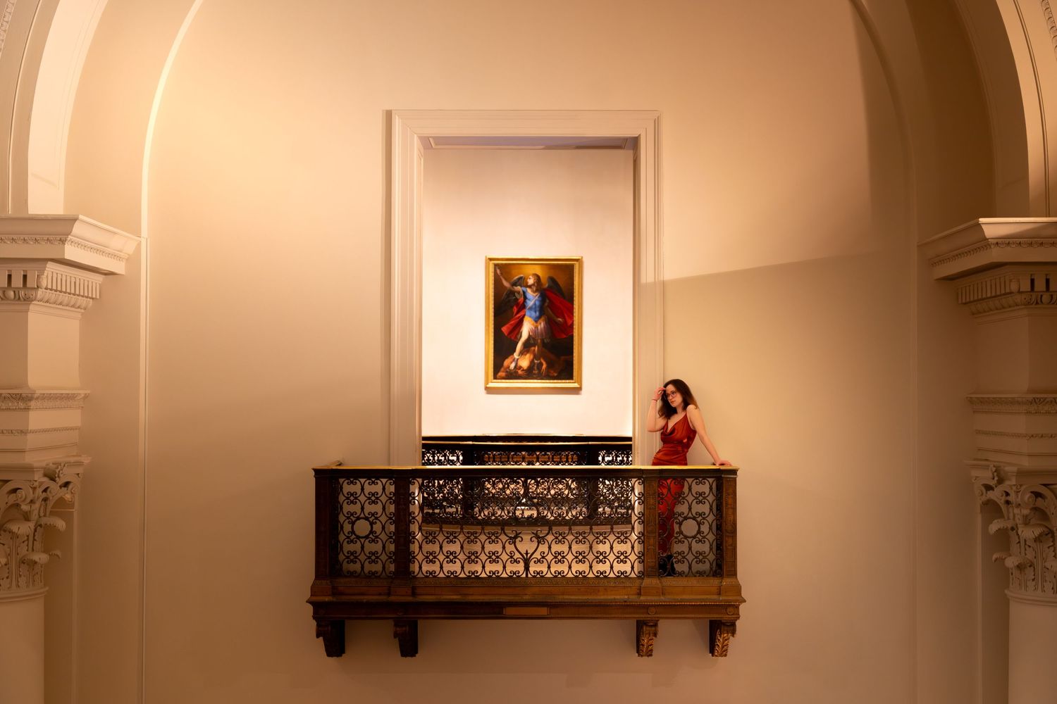
Honestly, this edit surprised me. When I first opened the photo, it just felt like a nice, clean shot of a beautiful space. But once I started playing with the tones and softening the light, it took on this super dreamy, almost cinematic mood that I wasn’t expecting — and that’s the fun of editing!
Somewhere along the way, it started giving me major Young and Beautiful by Lana Del Rey vibes. You know that kind of haunting, romantic, will-it-last kind of feeling? That. And it also lowkey reminded me of Great Expectations — like, all the drama, longing, and grandeur packed into one frame.
It just made me realize (again) how much editing can change not just how a photo looks, but how it feels. So if you’re just getting into editing, don’t stress about doing everything “right.” Just think about the mood you’re chasing and tweak the basics — warmth, shadows, highlights — until it feels like the story you want to tell.
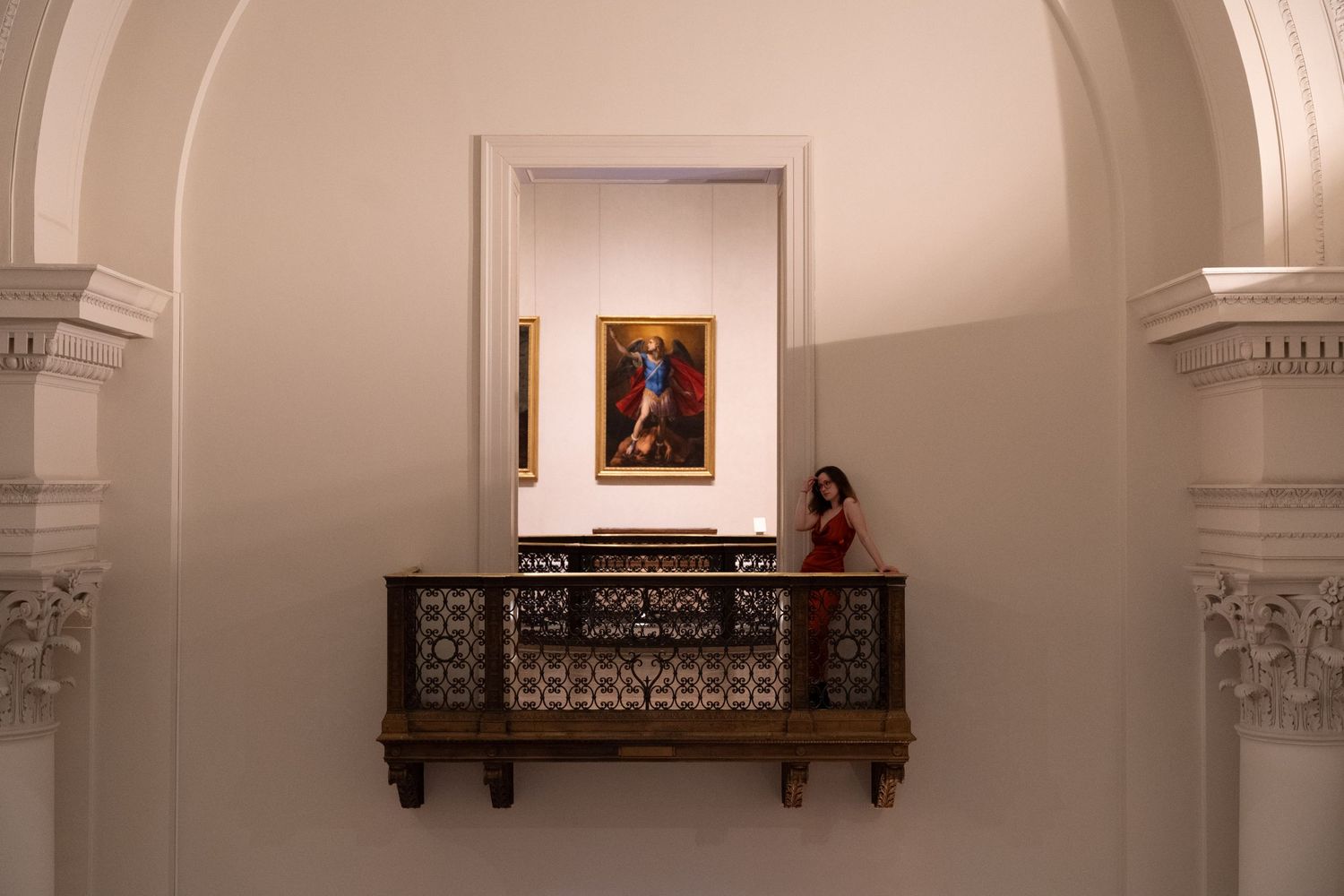
Practice Editing My Photo
Tag @lyds.photographyyI thought it’d be fun to share the RAW file for this photo in case you want to mess around with it. You've seen how I edited, now you try!
Honestly, this is one of my favorite ways to learn editing. It’s cool to see how different editing styles can change a photo's feel depending on the mood you go for. If you feel like it, send me your edit when you’re done — I’d love to see what you come up with.


